 Below The Benthic
Bulma Burger: Creating A Mobile Navbar With Bulma And Vue
Lately I have been learning Vue.js. In starting from a scratch Vue project, I weighed options of a CSS framework to use. I've used Bootstrap in the past, but I like how Bulma can function without jQuery and that it is completely built on flexbox (plus it looked like a cool thing to learn).
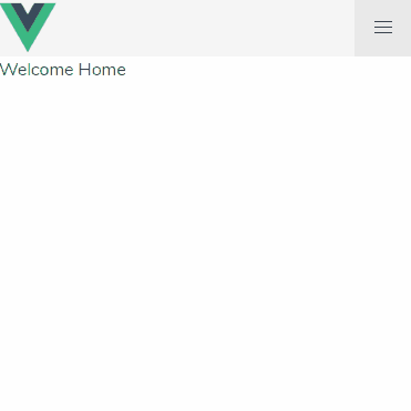
In creating a simple layout I started with a header and a few simple routes. Bulma has a cool navbar component that makes it easy to get things going.

The navbar component is of course responsive out of the box, but with Bulma being CSS-only, there is not a way to open the menu in a small/mobile view.
I went searching for a solution that worked with Vue, but it took a bit of searching and a little while to put the pieces together. In the spirit of Chris Coyier, I decided to create this post here. Hopefully your skimming ability was able to ignore all of this fluff and get right to the solution below.
The trick is creating a simple variable in Vue that defaults to false and can change on click.
export default {
   data: function() {
       return {
           isOpen: false
       }
   }
}
Now we can use Vue's v-bind to flip the appropriate Bulma class on and off. Here's the whole template:
<nav class="navbar is-light" role="navigation" aria-label="main navigation">
   <div class="navbar-brand">
       <img src="https://d2eip9sf3oo6c2.cloudfront.net/tags/images/000/001/036/square_256/vue.png">
       <a role="button" class="navbar-burger" aria-label="menu" aria-expanded="false" @click="isOpen = !isOpen" v-bind:class="{'is-active': isOpen}">
           <span aria-hidden="true"></span>
           <span aria-hidden="true"></span>
           <span aria-hidden="true"></span>
       </a>
   </div>
   <div class="navbar-menu" v-bind:class="{'is-active': isOpen}">
       <div class="navbar-end">
           <router-link to="/" class="navbar-item is-tab">Home</router-link>
           <router-link to="/about" class="navbar-item is-tab">About</router-link>
           <router-link to="/else" class="navbar-item is-tab">Something Else</router-link>
       </div>
   </div>
</nav>
And there you have it! When the burger icon is clicked, the isOpen variable simply gets changed to the opposite boolean value and the is-active Bulma class is toggled.
To continue discussion or comment, please reach out on Twitter.